Homepage Optimization for Web App Signup and Login
Reducing friction and copy is top priority for making conversions
10.5.2013
We are trying to gain sign-ups from new visitors
The product we are working with is Zesty. It's a bit more challenging because there are currently two ways into Zesty. One path leads the visitor to have a developer account, the other path gives them a business account. In the homepage image below you will see two large buttons to represent the action for each case (each case creates a different type of account in Zesty). Looking at this now, it clearly is confusing and misleading, but it felt brilliant at the time. This is very important to reflect on; we should always be fine tuning our tools. Let's have a look at the previous design.

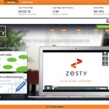
After being tested in the wild for 1 month, we found the design/flow not as successful as we'd like. We know this because we can test the success of this homepage using Google Analytic's In-Page Analytics. This tool provides great insight on how visitors interact with your website, in our case we noticed a few alarming metrics.
- 21%!o(MISSING)f clicks are below the fold
- The top right create account and login button are not being used on the homepage
- Visitors were clicking the logo on the homepage, which essentially refreshes the page
- The primary action buttons are onclick links which google does not track on this tool
How to respond to this information
All attempts at change are basically hypotheses until they are tested. The homepage iteration shown in the main image clearly one misses the mark. Before I jump into design I'm going to bullet out a few key aspects needed on the homepage.
Homepage re-design goals
- Only offer one way to create an account
- Attempt to reduce the friction of sign-up
- Keep a way to browse other pages of the website
- Make sure the homepage does not feel busy
- Have a single clear message
- Make it so bounce rate and clicks are fully tracked with Parsley GA Events
Based on our current marketing efforts, people directed to the site will already know what Zesty is. This helps minimize our message on the homepage. Rather than saying too much, we can basically just funnel them to signup. This leaves us with three important goals.
Funnel goals
- Get the visitor to create an account
- Point users with accounts to login or quickly view resources (like docs and videos)
- Make assets for blog writers and journalists easy to access
Reducing Sign-up Friction
Signup should be as fritcionless as possible. That said, we typically want an email and password, but is the password necessary? Couldn't we just take an email then ask for there password on the first screen of the application opening. Once we have their email, we can communicate with them, so even if they ignore this, they could go through a "forgot password sequence" worst case scenario. Dropping the required password on the sign-up will also allow us to have sign-ups on non SSL pages. This even allows us to have a signup as an ad on someone else's website!
Going in this way will add time into the main application build, which typically a web-designer will not have the power to do. Fortunately I'm in a position to make this change. Our new form will only to ask for name and email.
Brain storming ideas / Wireframing
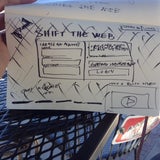
 I encourage everyone (engineers to designers) to use a pen and paper to quickly hash out a wireframe. Also, having an excuse off the computer for 20 minutes is a good thing.
When wireframing I'm keeping all of my goals in mind. I'm also not concerned with the way the other 200 pages on the Zesty website are designed. This page will be designed for pure conversion, I'm not going to let the current navigation get in the way of that. Fortunately my website builder allows me to do this!
The Result

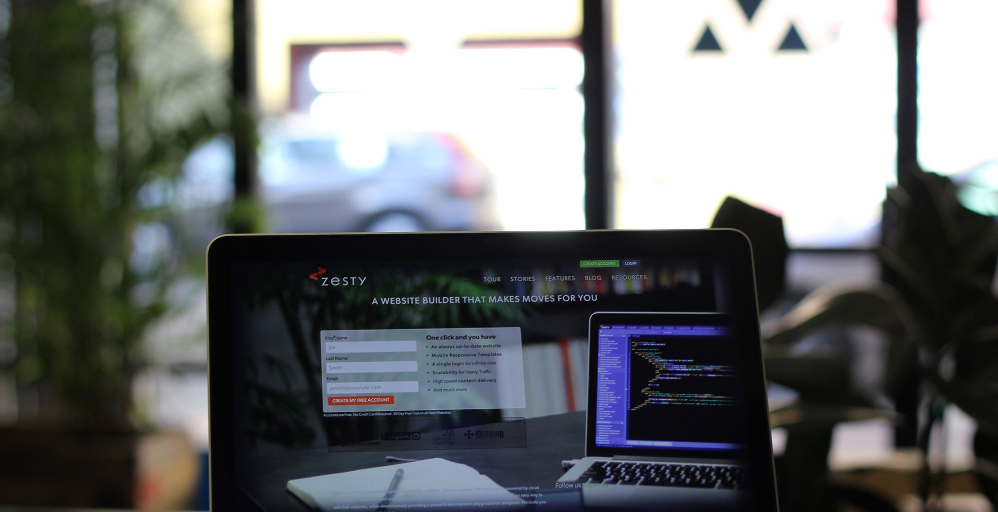
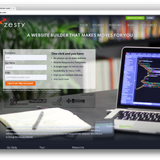
The final design took advantage of our Digital SLR using a 50 millimeter lens. It created a great atmosphere while still showing off the product. I took 20-30 shots keeping the position of the signup box in mind. The shot we ended up with had the best composition. Each goal was attained.
- We reduced friction on the homepage by putting the signup form right there. Recreating Zesty's login flow is a bit much for the redesign, but we got creative to reduce friction. Once they enter their info on the homepage they are redirected to the create account page where they only have to enter their password.
- Rather than heavy design elements, a fullscreen photo was used show off the software. They made everything less busy.
- Content was reduced to under 40 words.
- Google Analytic events were added to fix bounce rate and to track usage more accurately.
- The navigation remained where it is, but over the image. This keep usability for those visiting the site not to sign up.
The homepage is a living item on our website and will continue to be modified. I'll post the analysis results on this iteration next month.

In-page analytics from google shows click percentages from users. We can use this information to dictate position of our links in attempt to increase conversion.


